Friday, 4 May 2012

Wednesday, 2 May 2012

Saturday, 21 April 2012

Tuesday, 17 April 2012
Evaluation Question 1
In what ways does your media product use, develop or challenge forms and conventions of real media products.
Music Video
My creation of a music video for The Scripts song ‘Talk You Down’ challenged forms and
conventions of a music video by having no lip syncing or performance from the artist at all within the video. These are very strong conventions within music videos, especially when the artist is a band and this is also empathised due to the genre of the band being indie/pop-rock. As a replacement for the lip syncing I used lyrics on the screen so they were then visual as well as auditory.

By using scrabble letters to this I again challenged forms and conventions of an indie/pop-rock music video. I felt that the scrabble letters worked well with my video as they allowed for a break between the narrative story. I gained the idea of using scrabble letters to get the lyrics of the track onto the screen from an song 'Electric Feel' by MGMT who are an american pop/rock band.
I also used shots of my female cast member writing the lyrics, which also challenge the conventions of a typical video. However I think both of these ideas were appropriate alternatives and I felt that they fitted into the video concept, especially the writing of lyrics due to the fact it was wrote by my female cast member in an almost ‘love letter’ like form.

I have used and developed forms and conventions of music videos by having a narrative story
throughout the video and also by having a love/break-up theme to the music video. I began my video by using a lot of tight close up shots of my main cast member which is very common in other music video and in particular videos of a indie/pop-rock genre. As the pace and the beats in the song picked up speed the range and style of shots I used progress from extreme close ups and close up shots in mid shot, establishing shots, hand held shots and also high angle camera shots. As the video progressed I decreased the length of the shots and had quicker edits to match the beat of the song. I feel this worked extremely well with the song as it showed the how quick the narrative story (relationship between the two cast members) can change.


Once the video establishes to the audience that the video is about a break, after the first 50 or so seconds the camera shots and locations I used change. I aimed to portray to the audience that the male is chasing after the female to save their relationship and by using a range of locations such as the train station and inside a car and also by using a point of view camera shot from the males perspective.


This challenges all of The Scripts conventions as they tend to film the main artist throughout the video mainly lip syncing however I have changed this trend but I have however still gave the males perspective throughout the video. I also tried to show that the two cast members were seperate by having a shot of the female writing a letter which is also the lyrics. This also challenges forms and conventions as the female is a huge part of the video and the story is centre around her.

I also used and developed forms and conventions of a music video by using a variety of CCTV image camera shots. I gained this idea from a number of music videos but mainly from the song ‘Miami 2 Ibiza’ by Swedish House Mafia & Tinie Tempah. Although this could also be seen as challenging music video forms and conventions due to the fact that this idea came from a video of a totally different genre which is R&B. However these shots gave the impression and concept which I wanted which was to be shown as if the video was being watched back such as a CCTV camera footage is, i.e. so it is not in real time.


CD Digipak
With my CD Digipak which I produced I aimed to have the idea of a represenation of an advertisement for the front cover. To do this I took a picture of The Cube because this had a large bold black window on it and I thought this would be suitable to use as a billboard area. I think the front cover works well and is very eye catching to the target audience. I kept the back cover very simple by using an image of a row of bollards and then placing the track listing from The Scripts album over the top of this image. Although this was a very bland and simple shot I used this image becuase it had a good depth of field. To this cover I also added a unique bar code, The Scripts record label and also copyright infringment text, by doing this it made my CD Digipak look more authentic. I then moved onto the two inside covers. For these I used a large image of my cast and spread this across both covers. However this looked very ametuerish so I included a signiture style text of the artists/group name in the bottom right hand corner.


These are some exsisting CD front covers from similar artists. I can see similarities between all four of these existing CD covers and my creation of a CD Digipak for The Script.


These two CD covers from Scouting For Girls and Plan B are similar to mine by having an advertisement theme to them. The Scouting For Girls cover looks to be a poster style image with a radio which is a very popular way of promoting music. Where as the Plan B cover looks to be set at a gig or concert event. This one is extremely alike to my Digipak due tom the focus on the title as it is promoting the artist.


Music Video
My creation of a music video for The Scripts song ‘Talk You Down’ challenged forms and
conventions of a music video by having no lip syncing or performance from the artist at all within the video. These are very strong conventions within music videos, especially when the artist is a band and this is also empathised due to the genre of the band being indie/pop-rock. As a replacement for the lip syncing I used lyrics on the screen so they were then visual as well as auditory.

By using scrabble letters to this I again challenged forms and conventions of an indie/pop-rock music video. I felt that the scrabble letters worked well with my video as they allowed for a break between the narrative story. I gained the idea of using scrabble letters to get the lyrics of the track onto the screen from an song 'Electric Feel' by MGMT who are an american pop/rock band.
I also used shots of my female cast member writing the lyrics, which also challenge the conventions of a typical video. However I think both of these ideas were appropriate alternatives and I felt that they fitted into the video concept, especially the writing of lyrics due to the fact it was wrote by my female cast member in an almost ‘love letter’ like form.

I have used and developed forms and conventions of music videos by having a narrative story
throughout the video and also by having a love/break-up theme to the music video. I began my video by using a lot of tight close up shots of my main cast member which is very common in other music video and in particular videos of a indie/pop-rock genre. As the pace and the beats in the song picked up speed the range and style of shots I used progress from extreme close ups and close up shots in mid shot, establishing shots, hand held shots and also high angle camera shots. As the video progressed I decreased the length of the shots and had quicker edits to match the beat of the song. I feel this worked extremely well with the song as it showed the how quick the narrative story (relationship between the two cast members) can change.


Once the video establishes to the audience that the video is about a break, after the first 50 or so seconds the camera shots and locations I used change. I aimed to portray to the audience that the male is chasing after the female to save their relationship and by using a range of locations such as the train station and inside a car and also by using a point of view camera shot from the males perspective.


This challenges all of The Scripts conventions as they tend to film the main artist throughout the video mainly lip syncing however I have changed this trend but I have however still gave the males perspective throughout the video. I also tried to show that the two cast members were seperate by having a shot of the female writing a letter which is also the lyrics. This also challenges forms and conventions as the female is a huge part of the video and the story is centre around her.

I also used and developed forms and conventions of a music video by using a variety of CCTV image camera shots. I gained this idea from a number of music videos but mainly from the song ‘Miami 2 Ibiza’ by Swedish House Mafia & Tinie Tempah. Although this could also be seen as challenging music video forms and conventions due to the fact that this idea came from a video of a totally different genre which is R&B. However these shots gave the impression and concept which I wanted which was to be shown as if the video was being watched back such as a CCTV camera footage is, i.e. so it is not in real time.


CD Digipak
With my CD Digipak which I produced I aimed to have the idea of a represenation of an advertisement for the front cover. To do this I took a picture of The Cube because this had a large bold black window on it and I thought this would be suitable to use as a billboard area. I think the front cover works well and is very eye catching to the target audience. I kept the back cover very simple by using an image of a row of bollards and then placing the track listing from The Scripts album over the top of this image. Although this was a very bland and simple shot I used this image becuase it had a good depth of field. To this cover I also added a unique bar code, The Scripts record label and also copyright infringment text, by doing this it made my CD Digipak look more authentic. I then moved onto the two inside covers. For these I used a large image of my cast and spread this across both covers. However this looked very ametuerish so I included a signiture style text of the artists/group name in the bottom right hand corner.


These are some exsisting CD front covers from similar artists. I can see similarities between all four of these existing CD covers and my creation of a CD Digipak for The Script.
The top two covers from One Republic and Razorlight are similar to mine in terms of the placement of the bands name and focus point of the Digipak is the single main image of each band. These two are also very sdimilar to the inside covers of my Digipak as the single image of the bands draws all the attention right into the Digipak. I think the dull but bold colours really help gain this effect and also by having a plain background.


These two CD covers from Scouting For Girls and Plan B are similar to mine by having an advertisement theme to them. The Scouting For Girls cover looks to be a poster style image with a radio which is a very popular way of promoting music. Where as the Plan B cover looks to be set at a gig or concert event. This one is extremely alike to my Digipak due tom the focus on the title as it is promoting the artist.

Music Magazine Advertisement


These are some of the pictures I took for my music advertisement which in some ways are very similar to other images which are on real music magazine advertisements.


The effect/feeling I wanted to portray with this advertisement was a relaxed/socialising atomsphere. I did this by taking plently of pictures of my cast members both as a group and seperatly. I edited these and placed them into photoshop elements where I created the advertisement. My idea of a collage like advertisment came from researching and looking at other similar artists magazine advertisements and pictures taken of the artists. I realised after doing some research into this that the majority of the images of these artists were just general pictures and not pictures of them doing music related things as I had originally thought. I also felt that the idea to include as many pictures as I could on the advertisment was important because after all the Music Magazine advertisements purpose is to promote the band. Therefore I felt the closer I could make the audience feel to the artists the more succesful the advertisement would be.

Thursday, 5 April 2012
Completing My Music Video
I have now completed my music video by adding the Music channel logo and text at the beginning and end of the video.
Thursday, 29 March 2012
Beginning My Evaluation
I have began my Media Studies evaluation where I will look at my Music Video, CD Digipak and Music Magazine Advertisement. I will evaluate my research and planning, construction and feedback on all three of these tasks.
I have planned to do question 1 as a blog post where I will talk about the three tasks and use images from my video and existing videos to support my evaluation along with videos and other types of media where possible.
For question two I will produce as a prezzi presentation. I will also keep this media rich and try to keep the text to a minimum by only including key points.
I have decided that a movie will be suitable for questions 3 & 4. I should find this simple as I have used Final Cup Express a lot recently. I will include images of my video, CD Digipak and music magazine advertisement and may even include video in these.
I have planned to do question 1 as a blog post where I will talk about the three tasks and use images from my video and existing videos to support my evaluation along with videos and other types of media where possible.
For question two I will produce as a prezzi presentation. I will also keep this media rich and try to keep the text to a minimum by only including key points.
I have decided that a movie will be suitable for questions 3 & 4. I should find this simple as I have used Final Cup Express a lot recently. I will include images of my video, CD Digipak and music magazine advertisement and may even include video in these.
Tuesday, 20 March 2012
Completing My Music Magazine Advertisement

Saturday, 17 March 2012
Final Session of Filming
I have now completed filming and have all of the footage which I need in order to complete my music video. I re-filmed the CCTV image shots and these now look much better instead of my first attempt at these. I have used a wider range of camera shots for these as well so it is less repetitive.
Thursday, 15 March 2012
Creating A Music Magazine Advertisement
 This is a screenshot of me adding an effect to an image of one of my cast. I selected the 'crosshatch' filter which gives a 'grain' effect in a crosshatch pattern. I then altered the levels of each of the options on the right until the image looked how I wanted it too. I then added this to my Music Magazine Advertisement, and also did this for a number of other images and used a range of effects on these.
 I also used the rubber tool to soften the edges on some of the images and this allowed them to blend into the other images.
I also used the effect 'convert to black and white', I did this because I felt this worked extremely well on the brick wall as shown above. I felt this gave the image more meaning from the location.
Wednesday, 14 March 2012
Planning To Film
I aim to arrange to film within the next week. I will need to gather all the needed equipment eg: Clamp Tripod, Camera and Normal Tripod. I will also need to find out when my female cast member has the time to do this filming. I will be re-filming my CCTV image shot which is the reason why I need the clamp tripod. I am going to film this shot in different locations which will hopefully have more meaning, I also want to film a canted angle shot of my female cast member walking away from the camera and then the same of myself. I may also film an extreme close-up shot of the feet of two cast members, this could be done easily with great effect by placing the camera on the ground without the tripod.
Monday, 12 March 2012
Altering Some Shots
Today I decided to experiment with a section of my video which I wasn't sure about. The section is about 15 seconds in length, and is the final two line of lyrics from verse one. I replaced a selection of shots of the train station and a train with different types of shots of the same location. For example I removed a zoom shot of the train and replaced this with a shot of the train which I modified the speed of so that it was better suited to the music.
Friday, 9 March 2012
Continuity Within My Video
Today I have watched by music video through several times to check there are no gaps and all the shots go together. By doing this I spotted parts with poor continuity due to the way I have placed some shots from inside the car. I have now corrected these mistakes and also have been able to recognise areas which need changing/altering or re-filming. I will now begin to arrange filming sessions with my cast.
Wednesday, 7 March 2012
Fine-Tuning My Video
I have now completed my music video in terms of the layout of shots and the order of editing. When looking back through my video I have noticed that there is some colour correction to made to shots such as the scrabble letters because these were taken as pictures so the light levels differ. The framing of these shots also needs to be adjusted so they are all in line of the screen and aren't moving from letter to letter. I have also noticed that the shots I have filmed using the Clamp Tripod, may need to be filmed again because they are used a lot and getting this shot from different angles and in different locations should keep the audience more interested. I also think by re-filming this I could choose a location with more meaning rather than the current location, however I am still to decide on this and will think carefully about this.
Tuesday, 6 March 2012
Reversing A Shot
I have used the reverse shot effect in my production because I wanted this shot to give an impression that the male wants to go back in time. I think this shot works well with the lyrics "we're standing on a tiny ledge before this goes over the edge" as its repeating a small part of the video but backwards to what it was originally shown.
Thursday, 1 March 2012
Mise En Scene Of My Music Video
I have tried to make my music video look very similar to existing videos from The Script and I have done this by using as many outside locations and camera shots when possible. I did this because, by using more outside locations it allows me to show the audience that the video is set in an urban environment where as if my video was located only inside this would be harder for me to portray. Another reason for doing this is that existing videos from The Script are mainly located outside and set in places such as city/town centres , train stations and parks/recreational areas.
Wednesday, 29 February 2012
Using Livetype
 Today I have experimented using Livetype so I can apply the text over an image within my video. I used an easy to read text and a transparent background so that when I put it into my video production the image was shown and the text on top of this image. However after placing this into my video I wasn't totally convinced by the text as I felt it didn't fit in with the overall concept of my music video.
Tuesday, 28 February 2012
Using Video Transitions
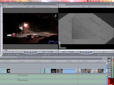
Today I have used the zoom transistion in my music video production. I used this between two shots of the writing of the lyrics onto paper because I had split this shot so the word 'suicide' stood out more. I think this is of good quality and makes the video more interesting by using a range of effects. To achieve this effect I used the effect-video transistion-3D Simulation-Zoom option and this resulted in the effected which I had visioned.


Thursday, 23 February 2012
Adding Effects To My Music Video
These screen prints are of my music video production where I have used all kinds of different effects and tools. For example I have used the crop and zoom tool on the screen print of the letter/writing on a page, in order to frame my image differently on the screen. I did this because I wanted the word 'suicide' to be more eye catching and forfront on the screen as this is a significant part of the lyrics.

I also edited the colour of the image by using the 'filter-video filters-colour correction-desaturate' tool. The reason I did this was because I thought that the black ink on the paper would be better fitting to the lyrics becuase it is a 'dark' line of lyrics and this colour is more of a representation of death than the original red ink would have been.

I also used the modify-speed effect so that the speed that the car travels matches the speed of the music. I did this by cuting the clip into sections, selecting the first part of the clip and increasing the speed to 200 percent, then progressively increasing the speed levels until it reached 800 percent which matched the peak of the musics pace.

I also edited the colour of the image by using the 'filter-video filters-colour correction-desaturate' tool. The reason I did this was because I thought that the black ink on the paper would be better fitting to the lyrics becuase it is a 'dark' line of lyrics and this colour is more of a representation of death than the original red ink would have been.
I also used the modify-speed effect so that the speed that the car travels matches the speed of the music. I did this by cuting the clip into sections, selecting the first part of the clip and increasing the speed to 200 percent, then progressively increasing the speed levels until it reached 800 percent which matched the peak of the musics pace.

Wednesday, 22 February 2012
Editing Scrabble letters
In todays lesson I continued to edit into my production, the scrabble letters of my lyrics. I placed these in the chorus and have shown these by having the word building up letter by letter. I will do some more editing with these however as the light levels are different between the shots.
Friday, 10 February 2012
Editing Filming of Scrabble Letters

Today I have edited in scrabble letters of the lyrics from my song into my music video production. As I had taken photos of these I found it tricky to time the editing and also cutting these to match it to the music and lyrics. However having said this I think these turned out well and look much better than my original way of getting lyrics onto the screen which was with the cards. By taking photos instead of videoing the scrabble letters it meant that all the images are in focus, they are easier to edit and also my hand isn't in the way from when I would have had to build the words up letter by letter.
Subscribe to:
Posts (Atom)